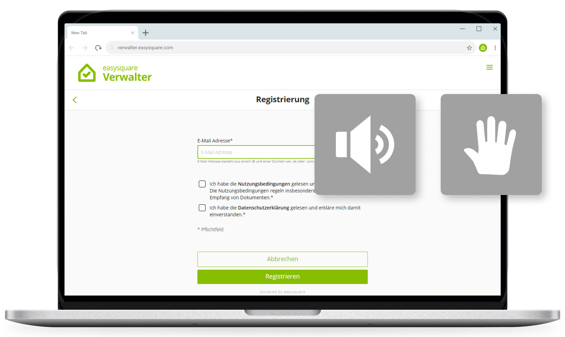
Update: increased accessibility in the easysquare apps
We in the easysquare team have set ourselves the goal of making all our mobile applications barrier-free in the long term. This requires a large number of measures, which we have been addressing in recent months. We have already achieved a great deal, and we intend to keep going full steam ahead in 2022.
Why barrier-free?
Not only blind people, but also the deaf, people with mental disabilities and many others benefit from barrier-free offers. According to the Federal Office of Statistics, there are more than 10 million people with disabilities living in Germany. The statistics also reveal that the country has nearly 18 million senior citizens. If we count the restrictions that emerge over the course of their lives, such as impaired vision among older people, it quickly becomes clear how important it is to make mobile solutions barrier-free.
In addition to these soft factors, which indicate the benefits of accessibility, there is also the aspect that achieving accessibility is already mandatory for some companies today. An EU directive anchored in Germany’s Federal Equality Act namely requires certain providers of digital services to gradually make their online offerings accessible. It can be assumed that the definition will be expanded and so the number of further institutions that have to offer barrier-free digital services in the future will increase.
Here, too, we are your foresighted and reliable partner in the real-estate sector.
What’s new?
We provided information back in May about the first implemented measures. The focus over the last few months has been on the fundamental pillars of accessibility: keyboard operability for the web app to ensure users do not need a mouse and the screen reader function. Can all functions in the web app be controlled by pressing the tab key? Is it clearly visible which control element is currently active? Can users navigate to “smaller” controls without any problems? And are there saved texts describing the entire interface so that a screen reader can read the page with no gaps?
Users have many questions and here are our answers:
Keyboard usability on the home, login and registration pages: Our first steps towards an accessible app involved making the home, login and registration pages keyboard-accessible. Users can therefore navigate through the pages using the tab key. Users with motor impairments and those who use screen readers depend on being able to move around the page without a mouse. We enabled this by rearranging and restructuring individual elements in a hierarchy and making buttons and navigation elements visually distinctive.
Screen-reader readability of the registration page: The screen reader reads the home page to the users in such a way that they can distinguish between texts, areas, buttons and navigation elements.
The registration page enables blind or visually impaired users to register and navigate. It is now possible to “see” elements such as input fields, checkboxes, text and links through voice output.
Registration page click areas: The user interface is easier to use if the control elements are easier to see and type. Click areas have therefore been defined for the respective checkboxes on the registration page to increase accuracy. Links within the texts can still be used and lead to the desired destination.
Input field component on the registration page: The realignment of the component architecture was implemented for the input fields. Texts now have a new font size and the more flexible REM unit instead of fixed pixels. So, when app users change the font size in their browser to make it “bigger”, the texts in REM – in contrast to non-scalable pixels – respond to this setting.
Checkbox component on the registration page: People with motor impairments may find it difficult to hit the box of a checkbox accurately. The description text for the checkbox has therefore been made clickable. Moreover, the visual marking of the focussed checkbox clearly stands out. The checkbox labels were additionally given a new font size, and all the margins and element sizes on the registration page were adjusted accordingly.
Bug fixes and style corrections: Following the conversion measures and more intensive testing, we noticed bugs that called for attention at the end of the year. We were able to make visual adjustments and corrections to the display and refine the styling, such as by eliminating the hover effects in checkboxes.

Voice output, keyboard operabilty and an easier-to-use interface give barrier-free access to the easysquare apps
What comes next?
Over the last few months, we have worked extensively on accessibility in our web app and its home, login and registration pages. We intend to work just as hard in the coming year – that is, over the next few weeks and months – on our form design and so on further optimising the accessibility of our solutions. As always, we will keep you updated here in our tech blog. So stay tuned!
We wish you all a merry Christmas and, more than ever, a healthy start to the New Year.
Please feel free to contact us if you have any questions or comments.

