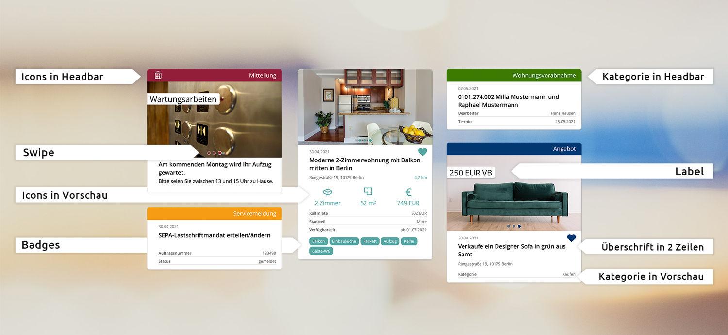
New: The generic style for even greater design flexibility in the form preview
We are used to consuming information online in as compact a form as possible. At the same time, we don’t want to forfeit the convenience of easy operation and an attractive design. The easysquare apps are therefore regularly checked with regard to these and similar user expectations and requirements, customer feedback is analysed and appropriate optimisation is then carried out. This is the only way to ensure that users are satisfied with our apps, that they enjoy using them and use them regularly. The object of our investigation this time is the form preview list in the easysquare apps. With the new generic style, we offer our customers even more design options, improved views and an optimised design for the form preview.
Where are form preview lists used?
Form preview lists are used in a wide range of places in the easysquare apps. From an overview of all existing contracts or damage reported in the tenant app in the past to marketplace entries in the neighbourhood service and residential advertisements in the potential tenant app – an overview of all existing entries appears in the left-hand area of the app everywhere where a series of forms can be listed in the app.
As a rule, each type of entry in the preview bar requires a different type of display. For example, the user expects a photo of the apartment in the case of a residential advertisement, whereas the calculated balance is more of interest in a preview of the operating cost statement provided. It was already possible in the past to set up individual views here for each form type.
What’s new?
The basic incentive for optimising the existing style was the feedback from our customers stating that a means of wrapping the title across two lines at different points would help with quick orientation. Previously, the title was cut off, which impeded an immediate intake of information. In addition, the design possibilities were limited, especially in the area of rental.
The new generic style provides a wide range of possibilities. From a comprehensive set of tools, the customer can choose for each form which information and design elements are to be displayed where and how in the form preview. From a label regarding a preview image through to various icons, a wide variety of options are available to make the form preview either more attractive or more useful. The generic style enables the customer to create an individual, visually harmonious and modern design – no matter in which easysquare app and tailored to the needs of the end user and the form type..
What are the highlights of the generic style?
Many users of the generic style will find the option of wrapping the title particularly useful. Where residential addresses or ad content were previously cut off at a critical point, a two-line display is now possible.
In the area of advertisements especially – be it in the marketplace of the easysquare neighbourhood function or, for example, in a residential advertisement – customers also benefit from significantly improved design options with the new generic style. Here are just a few examples:
- For instance, a label on the preview photo can quickly indicate the price or a discount promotion for the advertisement.
- Displaying categories such as "Exchange", "Rent" or "To give away" allows the user to directly classify the content of the advertisement.
- The generic style makes it possible to swipe between different images in the preview, which provides a significant advantage especially in the easysquare rental app.
- Icons to visually underscore the form content can be integrated both in the upper header bar and within the preview.

Have we sparked your interest and convinced you that you don't want to miss out on the benefits of the generic style? We will be delighted to advise you on what is necessary for a conversion and support you in designing your individual form previews.

